
How Furniture Colors Influence the Look and Feel of Your Commercial Space
Opening any commercial business is a complex process, and bringing together all the right elements is key to success. From layout and lighting to materials and finishes, every detail matters. One of the most important—and often underestimated—factors is the color of your commercial furniture
Whether it is restaurant booths, dining chairs, bar stools, or laminate table tops, these elements create the first impression when customers walk into your space. The right color combination can immediately deliver a “wow factor,” while the wrong choice can affect the overall atmosphere and customer experience.
Furniture colors are not just about design—they influence how people feel, behave, and interact within your space.
First Impressions and Visual Impact
When guests enter a restaurant, hotel, or lounge, the colors of the furniture are one of the first things they notice. Colors help define the identity of the space and set expectations for the experience.
A well-coordinated color palette can make a space feel:
-
warm and inviting
-
modern and upscale
-
energetic and vibrant
-
calm and relaxing
On the other hand, poorly selected or mismatched colors can create confusion and reduce the overall appeal of the space.
Trends in furniture colors change over time, just like fashion and interior design styles. However, selecting colors should not be based only on trends—it should also align with the concept and purpose of the business.
Every Color Has an Action and Reaction
Color psychology plays a major role in hospitality design. Each color creates a different emotional and physical response.
Key Color Reactions
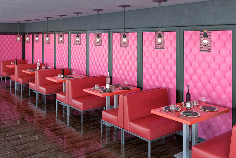
Red – Associated with passion, energy, and urgency. It can increase heart rate and stimulate appetite, making it popular in restaurants.
Blue – Known for calmness, trust, and reliability. It creates a relaxing environment but can feel distant if overused.
Yellow – Evokes happiness and warmth, but too much can cause overstimulation.
Green – Linked to nature and balance, often promoting relaxation and comfort.
Purple – Represents luxury and creativity, commonly used in upscale environments.
Pink – Associated with warmth and softness, creating a welcoming feel.
Black – A powerful color tied to elegance and sophistication, often used in nightlife settings.
White – Represents cleanliness and openness, ideal for creating a modern and spacious look.
Physiological and Environmental Effects
Colors can also create physical responses. Warm tones such as red, orange, and yellow can increase energy and stimulate activity, while cooler tones like blue and green promote calmness and relaxation.
This is why restaurants often use warmer tones to encourage engagement and turnover, while lounges and hotel spaces may use cooler tones to encourage guests to stay longer.
Pairing Colors for Maximum Impact
One of the most effective design strategies in commercial furniture is color pairing, especially in two-tone combinations. Using contrasting or complementary colors on booths, lounge seating, sofas, and chairs creates depth and visual interest.
For example:
-
dark base with light backrest
-
bold accent color paired with neutral tones
-
two-tone booth seating with matching chairs
Working with experienced manufacturers such as Modern Line Furniture allows operators and designers to explore these combinations more effectively. Their ability to provide material samples, swatches, and custom finishes makes it easier to pair colors across different furniture pieces, including restaurant booths, lounge seating, sofas, and chairs.
Two-tone furniture not only enhances design but also helps define zones within a space, making the layout feel more intentional and visually appealing.
Balancing Color with Functionality
While color is important for aesthetics, it must also support the practical needs of a commercial space. High-traffic environments require materials and colors that can handle daily wear, spills, and cleaning.
Darker tones and textured materials tend to hide wear better, while lighter tones create a clean and open feel but may require more maintenance.
Lighting also plays a critical role. Natural light, warm lighting, and LED lighting can all affect how colors appear in the space. This makes it important to review samples in the actual environment before finalizing decisions.
Coordination with Interior Design
Furniture color should always work in harmony with:
-
flooring
-
wall finishes
-
lighting fixtures
-
decorative elements
A cohesive color scheme creates a professional and polished look.
As Veronika Lemeshenkova, Sales Manager, explains:
"Selecting the right furniture colors is critical. Keep in mind how each color affects your guests and make sure it works with your entire interior design concept."